Association for Talent Development
React Front End Engineer
•Merkle - Digital Experience
Summary
Association for Talent Development (ATD) is a leading knowledge platform for workplace learning and development professionals, offering educational courses, certification programs, workshops, and community resources. ATD partnered with Merkle to redesign the Courses & Certification section of their public website.
This project presented unique challenges: a tight 2-month timeline, a client-managed codebase and Contentful instance, and evolving design requirements. I served as a key contributor, leveraging my Contentful Certified Professional credential to architect new content types and components while learning GraphQL for content queries and working extensively with ChakraUI.
My contributions centered on designing and implementing new Contentful content types and components tailored to ATD's content strategy. I also redesigned and optimized existing UI components to align with the new visual direction while improving performance. Throughout the project, I introduced quality-of-life improvements that enhanced both the developer experience and overall site functionality.
This project expanded my technical toolkit with hands-on experience in GraphQL and deepened my expertise in headless CMS architecture. Below are a few examples of the components for which I was responsible.
Key Features
- Enterprise React & TypeScript application - Contributed to a large-scale, production-grade codebase with modern development practices
- Courses & Certification redesign - Delivered a contemporary visual refresh that elevated the user experience while maintaining brand consistency
- Flexible content architecture - Engineered Contentful content types that balance content author autonomy with seamless, intuitive end-user experiences
- Backward-compatible component system - Preserved existing component functionality while introducing opt-in design updates, allowing content authors to migrate at their own pace
Toolset
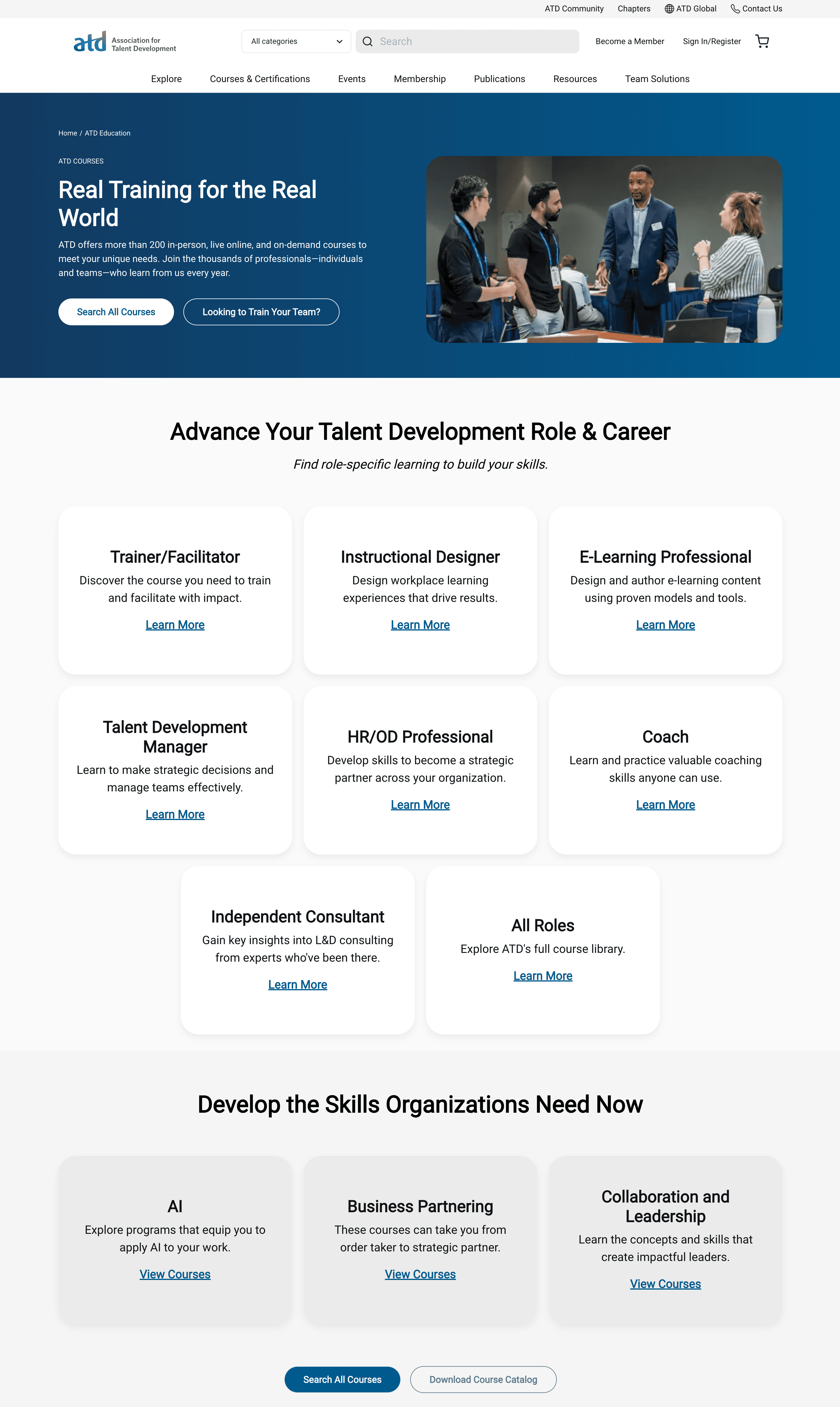
A basic version of the header component features a headline, description, and CTA buttons on the left, and an image on the right. Highly reusable card components are featured here in two variations. Cards components are contained in a CardCollection component, set in the grid layout.

Another version of the Card component inside a CardCollection component. This CardCollection is set to display as a carousel with 3 cards visible.

A version of the header component with a featured course displayed in the right column instead of an image.

Another version of the header component with subscription details displayed in the right column instead of an image.